by Jiri Bouchal (Digital Resilience Institute), Hugo Matousek (InnoConnect), Jan Ježek (University of West Bohemia)
GLayer is GPU-accelerated backend software designed for fast aggregation, filtering and visualisation of spatial data. Modelled on the OpenGL technology, GLayer is capable of performing analytical queries on large-scale datasets with millions of data points in a matter of milliseconds. At present, the tool is being tested in Aarhus as part of the BIPED project to support the city’s transition to net-zero emissions.
GLayer exploits thousands of lightweight processing cores in a GPU unit to achieve its performance. Upon entering GLayer, a dataset is split into smaller segments. Because each is handled simultaneously by one of many GPU cores, aggregation-based analytics can be performed exceptionally fast. Even with standard GPU hardware, such as that used in laptops, it takes less than 100 milliseconds to process tens of millions of records [1].
In addition to a fast response time, GLayer provides graphically rich output to aid visual analysis of processed data, in the form of dashboards and heatmaps. These front-end tools can aid decision-making in a variety of sectors, from transport and the environment to public health and safety (see Figure1).
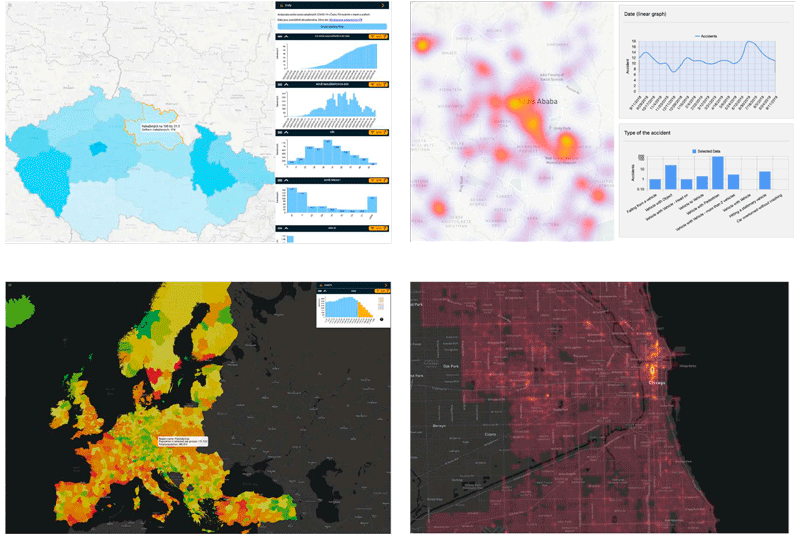
Figure 1: GLayer-based maps of COVID-19 infections in Czechia (top left), traffic incidents in Ethiopia (top right), Europe demographic data (bottom left), and crimes in Chicago (bottom right).
Architecture
The GLayer Server software architecture is designed as a distributed, modular system that integrates diverse data sources to create and manage a high-performance, GPU-accelerated index (see Figure 2). This index is optimised for scalability and operates either as a single node or in a multiple node configuration, leveraging parallel processing capabilities to handle large-scale datasets efficiently.
Figure 2. GLayer Server architecture.
At its core, the GLayer system features a robust data-ingestion layer that normalises and preprocesses incoming data from various sources, such as traditional relational databases via JDBC, NoSQL databases, with information then fed into the GPU-based indexing engine.
The project management user interface (UI) [L1] enables users to manage data sources, configure indexing parameters, and coordinate collaborative workflows seamlessly. Specifically, it serves three main purposes:
- Datastore configuration: data connectors can access data from permanent storages such as SQL databases (local or remote) or csv files
- Project configuration: a project can define how the dataset is going to be visualised and filtered. This includes data type definitions, aggregation strategies, filtering capabilities and cartographical outputs such as choropleth maps, heat maps, histograms etc.
- Project visualisation: The system includes a web-based visualisation client, providing users with an intuitive interface for exploring indexed data through dynamic, interactive visualisations.
The overall system is built with a microservices approach to ensure modularity, fault tolerance, and scalability, while the frontend leverages modern web technologies for a responsive and user-friendly experience.
Besides the GUI frontend, GLayer supports integration with other systems via an Open Rest API. The API offers extended capabilities for accessing third-party data without having to alter the data source or reconfigure the underlying project. The case study below illustrates how this was done in practice using TomTom data to support the development of a traffic model for Aarhus.
Aarhus use case
Aarhus wants to become climate-neutral by 2030. To achieve this goal, the city needs to offset its current footprint of about 1.3 million tons of CO2e. A macroscopic traffic model is currently being created as part of the BIPED project [L2] to provide scenario modelling for decarbonisation-oriented planning measures.
The model relies on several inputs. One is the manually enhanced traffic network from OpenStreetMap. Another is the origin-destination (OD) matrix, which was developed using big traffic data from TomTom, such as data from SIM cards and transportation records [L3].
Information on average speeds and travel times was extracted from TomTom reports for selected road segments and time periods (15-21 January 2023, 15-21 April 2023, 15-21 July 2023, 30 October 2023 - 6 November 2023). The aim was to provide a representative picture of the traffic situation in the city during a full week (i.e. without public holidays) in each season (winter, spring, summer, autumn).
For each day of the week, a full traffic report covering all the main road segments in Aarhus was generated, with data points aggregated on an hourly basis. Spatio-temporal data was then parsed via a custom configurable script to enable its mapping onto a corresponding database entry.
Policy makers can access this data via GLayer’s interface (see Figure 3) without writing any code. They can filter data according to a desired period or day of the week to get aggregated insights for several or all road segments or view the traffic situation at a particular point in time in a single segment.
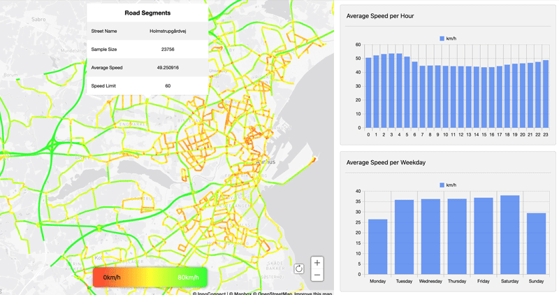
Figure 3: A traffic-speed dashboard for Aarhus with segment visualisation and charts based on GLayer.
With the current data from TomTom, the traffic data from which the OD matrix was created covers the city’s traffic only partially (15-25%). Additional data acquisition is planned to further improve the model and provide accurate insights into city-wide traffic patterns that can be used as a basis for cross-sectoral ‘what-if’ simulations [2].
The GLayer use case in Aarhus is developed as part of the BIPED project, which has received funding from the EU Horizon Europe Research and Innovation programme under Grant ID 101139060.
Links:
[L1] https://innoconnect.net/docs/GLayer/project-configuration/
[L2] https://www.bi-ped.eu/
[L3] https://www.tomtom.com/products/traffic-stats/
References:
[1] J. Ježek, et al., “Design and Evaluation of WebGL-Based Heat Map Visualization for Big Point Data,” in The Rise of Big Spatial Data, I. Ivan, et al., Eds., Lecture Notes in Geoinformation and Cartography, Springer, 2017, pp. 118–122, https://doi.org/10.1007/978-3-319-45123-7_2.
[2] J. Ježek, K. Jedlička, and J. Martolos, “Visual analytics of traffic-related Open Data and VGI,” in Proc. ICIST 2015 Conference, 2015.
Please contact:
Jiri Bouchal
Digital Resilience Institute, Czech Republic
