by Stelios Zimeras (University of the Aegean)
At the University of the Aegean, we are developing advanced visualisation techniques and innovative algorithms to enhance digital epidemiology, enabling more effective disease monitoring and response through the integration of diverse big data sources.
The management of big data is an important but also demanding process where important decisions must be made. An essential role in the data processing process is both the collection and the organization of data in such a way that they efficiently bring about the best results.
Characteristics of big data are their diversity, speed of production and renewal. Based on the above, we are led to the development of analysis and visualisation techniques in order to analyse both the relationships and the structures set included in each dataset. Due to the multitude of features that govern big data, it is difficult to visualise and work with all of them. This has created the need to develop algorithms that help process and visualise multidimensional data.
New algorithmic techniques have enabled the creation of new tools for data processing, such as artificial intelligence, machine learning, and natural language processing. All of this has contributed to the emergence of a new branch of epidemiology called digital epidemiology [1]. Digital epidemiology embraces the goals of clinical epidemiology but takes a different approach to their implementation. Instead of relying solely on data from the health sector, it makes use of these alternative data sources. These new data sources, such as social media, are also called “big data” sources and are characterised by very large volumes of data that are complex in structure and highly heterogeneous [2]. Thus, one can search for information that may be related to a disease. Therefore, the electronic search data can provide information about the spread of a disease in a place when the electronic searches by the residents are largely related to the health, diseases and medical personnel of the area. This development was accompanied by several implementations in this field. Some of them are [3]:
HealthMap [L1] is a non-profit implementation that aims to collect and visualise important information related to public health risks and, basically, information about impending or evolving epidemics, with the aim of informing the human population. The HealthMap interface consists of an interactive world map, which provides information on any public health risks in each region, but also in the world in total. The system also detects the location of each user and, initially, provides information for the area near the user, thus achieving the correct information of the user on urgent issues that directly concern them (see Figure 1).
BioCaster [L2] is a subscription-based, non-governmental, free-to-use, research-based data stream monitoring program from various sources with the aim of safeguarding public health. The aim is to identify new outbreaks of diseases and monitor their spread. To display confirmed events, BioCaster uses a Google Maps-based interface in which it displays confirmed events based on their geographical location, while it is also possible to update its subscribers via e-mail messages. (see Figure 2).
EpiSPIDER - Semantic Processing and Integration of Distributed Electronic Resources for Epidemics and Disasters [L3] is an automated program for collecting information on human and animal diseases, while also collecting information on natural disasters. Also, as complementary data, demographic information and information related to public health are collected. The system then processes, analyzes and automatically classifies the data into various groups. This process is enhanced by the use of a natural language processing system (see Figure 3).
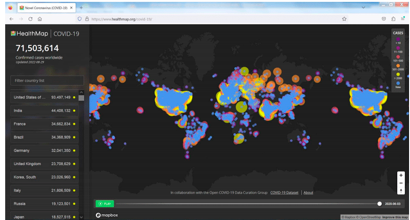
Figure 1: HealthMap’s interface with disease outbreaks around the world.
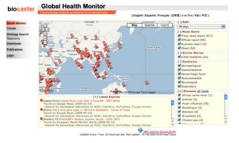
Figure 2: BioCaster Interface.
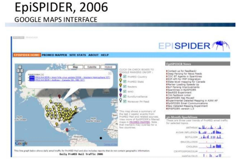
Figure 3: EpiSPIDER Interface.
The JHU COVID-19 Dashboard [L4] is a platform for recording and visualizing confirmed information about the spread of the coronavirus in various regions of the world. The application is part of the Coronavirus Resource Center, Johns Hopkins University, which collects information about the virus and its spread for various purposes. The COVID-19 Dashboard features an interactive global map that displays information on the total number of cases and deaths due to the coronavirus in various regions of the world. The map is also accompanied by graphs that show the growth of cases of the virus, and by figures that relate to cases and deaths worldwide and for specific countries (see Figure 4).
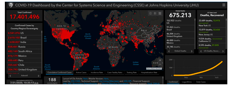
Figure 4: COVID-19 Dashboard Johns Hopkins University Interface.
Links:
[L1] https://healthmap.org/en/
[L2] https://earlywarning.wordpress.com/2009/02/14/detecting-rumors-with-web-based-text-mining-system/
[L3] https://www.slideshare.net/hermantolentino/2009-epispider-cdc-gis-day
[L4] https://coronavirus.jhu.edu/map.html
References:
[1] G. Lippi, C. Mattiuzzi, and G. Cervellin, “Is Digital Epidemiology the Future of Clinical Epidemiology?”, J. Epidemiol. Glob. Health, vol. 9, no. 2, p. 146, 2019.
[2] A. H. Ali and M. Z. Abdullah, “A survey on vertical and horizontal scaling platforms for big data analytics,” Int. J. Integr. Eng., vol. 11, no. 6, pp. 138–150, 2019.
[3] A. Gribas, “Big Data Processing in Digital Epidemiology,” M.Sc. Thesis, EMP, 2020.
Please contact:
Stelios Zimeras
University of the Aegean, Greece


