by Bert Bos (W3C/ERCIM)
In 2020 the global pandemic accelerated a global trend towards virtualisation, making the Web even more critical to society. W3C converted its physical meetings and workshops to virtual ones, tapping into the capabilities of the Web it has been leading for over 25 years.
We replaced the usual presentations with recorded videos that participants could view in their own time before the meeting. For the two W3C member meetings (May and October 2020) and a workshop in September, the W3C team created special web pages to make watching talks as convenient as possible. To make the videos easier to follow, and accessible, we added transcripts and subtitles in four languages (English, Korean, Japanese and Simplified Chinese).
We leveraged our own technologies, such as HTML, WebVTT and CSS. At the core are the HTML elements <video>, <track> and <audio>.
The whole process took six weeks from creating the agenda and inviting the speakers to publishing the video pages.
The video pages
A combination of server-side and client-side code combined the videos, slides, transcripts and subtitles into web pages, one page per presentation, with navigation links between them (see Figure 1).
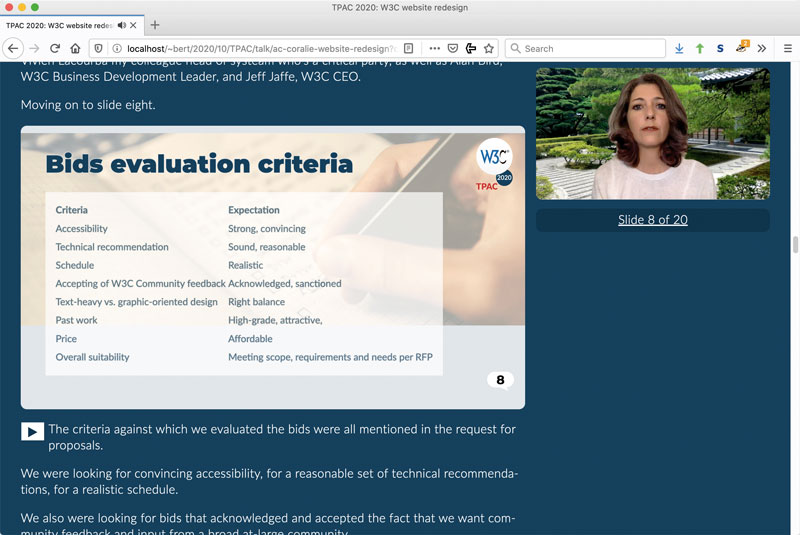
Figure 1: Screenshot of a medium-size browser window with the slides and the transcript on the left and a small video on the right.
The pages allow different ways to watch the talks: by reading the slides and the video transcript; by playing the video in a corner of the screen while reading the slides and the transcript; or by watching a synchronised slide show and video side by side (“kiosk mode”). The video can display captions or subtitles. When watching the slide show, the captions or subtitles are under the slides.
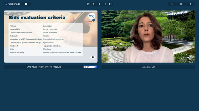
Figure 2: Screenshot of a maximised browser window, showing ‘kiosk mode’: one slide on the left, the video on the right and subtitles (here in Korean) under the slides.
Captions and subtitles
To make the captions and subtitles, we hired the services of a specialised company. That gave us captions with good timing, although the text needed some editing. Many speakers were not native speakers of English and several talks were technical in nature, which is probably why some words were not correctly transcribed and some punctuation was wrong. The English captions needed a little editing; the translations needed more.
The transcripts were generated from the captions, with minimal editing, most notably to mark the places where the speaker moved to the next slide.
Video hosting
We did not host the videos ourselves, but got help from WebCastor, who offered their StreamFizz platform. Using a video hosting service has advantages and disadvantages. The platform automatically provided lower-resolution versions of each video and switched between them depending on bandwidth; it made backups; and offered good network connection. On the other hand, it limited the accuracy with which captions, slides and video could be synchronised and it required the captions to be loaded twice: once to display them in the video and once to display them under the slides, because the video player could not export them.
Accessibility and the default user interface
A page that is built by a program from various pieces made by different people, and which on top of that contains scripts that modify the contents in response to user actions, has a high risk of not being very usable. There appeared to be a difference of opinion between people relying on the visuals and those relying on assistive technology, with respect to one aspect of the pages: Everybody liked the “kiosk mode”, but people seeing the pages for the first time had trouble realising that it existed and then had trouble finding the button to activate it. We tried different wordings for the button, but then, on the advice of the “visual” people, just made kiosk mode the default. There was still a button, but it served now to exit from kiosk mode.
However, that led to complaints, because people relying on assistive technology now found themselves on a page that appeared to be incomplete, with only one slide and no transcript. They had trouble understanding that the button would reveal the other slides and the transcript. So, in the end, we went back to the transcript mode as the default, with a button to enter kiosk mode. We also added a help page with a longer explanation of the button. And we made it so that, if people navigated to the next talk while in kiosk mode, that next talk would start in kiosk mode.
Continuous system improvements
As detailed in a blog article [L1] on the W3C site, we improved the system after the first meeting. We allowed PDF slides in addition to the Showr and b6+ slide frameworks. The kiosk mode now only shows the current slide, the video, buttons to navigate the slides, buttons to jump to the next/previous talk and a button to exit kiosk mode. It omits the usual header, footer and menus of other web pages, and it has no scroll bar anymore. Finally, in version 1, the slides and video were scaled down on small screens, but not scaled up on (very) big ones. They are now always as large as possible. That allows watching them on a TV screen while sitting at a distance.
Link:
[L1] https://www.w3.org/blog/2020/09/making-video-pages-for-the-w3c-ac-meeting/
Please contact:
Bert Bos, W3C, France,
