by Paulo Carvalho, Patrik Hitzelberger and Gilles Venturini
Open Data (OD) is one of the most active movements contributing to the spread of information over the web. However, there is no common standard to publish datasets. Data is made available by different kind of entities (private and public), in various formats and according to different cost models. Even if the information is accessible, it does not mean it can be reused. Before being able to use it, an aspiring user must have knowledge about its structure, location of meaningful fields and other variables. Information visualization can help the user to understand the structure of OD datasets.
The Public Research Centre Gabriel Lippmann (Luxembourg), together with the University François-Rabelais of Tours (France) are currently running a project studying OD integration and how information visualization may be used to support the end user in this process. There are numerous obstacles to overcome before the great business and societal potential of OD can be realized. This project aims to address some of these obstacles.
A key problem is the plethora of available formats for OD, including: PDF, CSV, XLS, XML and others which may or may not be machine-readable. In 2011, PDF was the most common format. Since then, however, things have been changing. The use of machine-readable formats is strongly encouraged by several initiatives. The use of tabular data representation, CSV format in particular, is continually growing. Despite the increasing popularity of such files, there is a dearth of recent studies on tabular information formats and their visualization. The last relevant work in this field was published in 1994 - Table Lens visualization for tabular information [1]. Our project addresses this gap in the research, focusing on CSV format since it is currently one of the most OD used formats and the most important tabular data format.
Although CSV is a simple tabular format, its semantic and syntactic interpretation may be difficult. Since CSV does not have a formal specification, the interpretation of files can be a complex process. Nevertheless, the interpretations converge to some basic ideas described in the RFC 4180 [2]. In order to reuse OD datasets, it is mandatory to get a global idea of their structures. Information visualization may be used to create a real-time solution in order to obtain a quick and efficient global overview of OD CSV files. Our intention is to provide an effective tool to:
- estimate the size of analysed file(s);
- show the entire structure of OD CSV files;
- view what kind of data each cell contains;
- detect errors so the user can complete/correct them before use;
- detect and locate missing values;
- compare the structure of different generations of CSV files, because OD datasets are commonly published periodically.
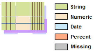

Figure1: Example CSV file and an example of Piled Chart.
Piled Chart has been created to achieve these objectives. Piled Chart shows the entire structure of a CSV file using a cell-based shape and a colour code. In the Piled Chart, sequences of rows with the same structure (rows with same data type in each cell) are piled (grouped) into a unique row (see Figure 1). The same principle is applied to the columns: columns with the same structure are grouped into a unique column. Furthermore, cells are colour-coded according to data type. Supported data types are currently numbers, strings, dates and percentage. A special colour is also applied for missing values. Because similar rows and columns are grouped, the CSV file can be represented using a reduced area giving the user a smaller surface to be analysed.
Piled Chart shows great promise, but still has room for improvement. For now, Piled Chart is unable to inspect several files simultaneously. This limitation is important, especially for files published periodically by the same entity (e.g., the monthly expenses of a government). We do not yet know how the system responds when large files are analysed, thus tests with large files must be performed. The problem of scalability, which applies to many algorithms in information visualisation, is challenging. The user-friendliness of the approach also needs to be evaluated; a user must be able to easily understand the information shown on the graph and the interaction must be easy and fluid. The project will continue until the end of 2016 in order to address these questions.
References:
[1] R.Rao, S. K. Card: “The table lens: merging graphical and symbolic representations in an interactive focus+ context visualization for tabular information”, in proc. of the SIGCHI conference on Human factors in computing systems (pp. 318-322), ACM, 1994.
[2] Y. Shafranovich: “Rfc 4180: Common format and mime type for comma-separated values (csv) files”, Cited on, 67, 2005.
Please contact:
Paulo Da Silva Carvalho
Centre de Recherche Public - Gabriel Lippmann
E-mail:
